Digital accessibility is something that should be foundational – in the same way that design should start with positive (functional) user experience or content should be written with SEO in mind. And there’s plenty that can be done whether you’re revamping a site that’s been around for 10 years, or starting a new page from scratch today.
Here are seven starting points for designing, writing, and developing to improve digital accessibility:
1. Thinking in colour
Colour, contrast, and pattern are absolutely crucial for those 285 million people around the world who are visually impaired. You should provide sufficient contrast between foreground and background for all web elements including text and buttons. The only exception is links which might be inactive (i.e. greyed out) or similar. Black on white is the simplest choice as it provides optimal contrast, but it isn’t the only option — you just need to get the contrast ratios right.
It’s also good practise to use more than just colour to communicate. For example, in a form which has required fields – it’s better to find an additional or alternative method to highlight those required than simply marking them a different colour. Where you might previously have written “Required fields are in red”, try instead “Required fields are in red and marked with a *“.
Another example is highlighting or referencing content by colour. To somebody who has no issue seeing colour, a red button might indicate that a form has not been correctly completed. For somebody who is colourblind, the button’s colour might mean very little. By including an additional element — like pattern — communication and referencing becomes much simpler. Trello’s “Colorblind Friendly Mode” is a great example of how to execute this.
2. Make it interactive
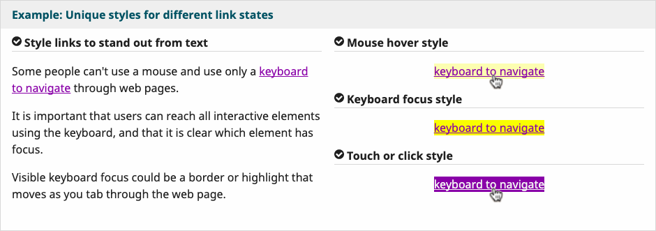
It’s key that interactive elements on websites are clearly distinguishable from standard content. Distinctive styles for these elements, that are on brand and visually consistent, ensure those that are navigating in any method can differentiate. Below is an example from W3C’s Web Accessibility Initiative.

3. Caption it
Podcasts and video content are increasingly engaging, but if you aren’t providing closed captions or transcripts then you’re missing a trick for the wider audience that can’t appreciate your efforts. For audio content, it’s good practice to provide a transcript which not only communicates the spoken content but also shares any other key information which somebody might require for context. For videos, captions and transcripts make sense – and again, be sure to share any visual context that might otherwise be missed in the transcript. Gymnasium have a great video on accessible audio and video here.
4. Control alt tags
Alt tags, or alternative text fields, allow those with low visual ability to basically “hear” web content. If you’re sharing photos or graphics and you’re not completing those alt tags, you’re making that content redundant for those who can’t see it.
Don’t just write “picture” in this field. You’ll need to describe what is pictured and how that’s relevant to the page’s content — as if someone was telling you about it over the phone. Leave it blank, and it will just read the file name… that’s not something that anybody wants!
5. Structure and hierarchy
When developing a website, you’re able to set styles up for text content. You might set a large bold font for your <H1> tag, and a <H3> style might just be the same as your standard text but italicised. Using these tags as they’re intended establishes a hierarchy that allows your content to be easily navigated. Get it wrong and suddenly navigating your blog posts is a nightmare.
Having a style guide that effectively communicates how this should work means that you won’t fall into the trap of using important navigating styles for effect. It can get much more complex than this, and there is much more than just text styling to assist navigation, so feel free to seek help from somebody in web development. Check out W3C’s example here too!
6. Tap targets
This one is true for everybody, regardless of motor skills, and you’ve likely experienced it yourself. Particularly on mobile devices, it’s essential that the tap target for a button or link be large enough for you to actually activate. If this isn’t possible, consider whether there is a design work around that changes the dynamic of the button. One example of this is on the Youtube application — the Play/Pause button isn’t accessible in the bottom left corner (as it would be on a computer screen) and so the centre of the video offers that functionality instead.
Guidelines range on the exact sizes required, so it’s best to test this rigorously to work out what works best for your app or site.
7. Keyboard navigation
A lot of these steps don’t matter if you can’t utilise accessible navigation. Navigating via keyboard is a more widely accessible option compared to mouse or touchscreen, so make sure that — at the very least — using Tab and Enter function properly. Provided you’ve established clear hierarchical navigation through coding, these keys should allow for a logical and intuitive user experience.
This list is by no means a comprehensive to-do list to get your website to a place where it is universally accessible, but it is a good start if you can comfortably say that you’re thinking about these things when you’re updating or designing. Even better if you can say comfortably that you’re already doing these things!
Getting Started With Digital Accessibility Guide
Download your free copy today to read up on who’s responsible, how you can get started, hiring a specialist to help out and much more!
If there’s just one thought to leave you with, it’s that there are countless accessibility tools available for you to utilise. You can test your page in all sorts of ways, and you should. Test, test, and test again. If you can, get real feedback from real people. If not, the tools online should help to begin to simulate some of the user experiences to help you understand what you’re working towards.
Making your site more accessible improves the experience for everyone.
This post was originally published on our Aquent UK website
Latest.

Australian AI Tech: Our untapped business advantage.
Technology, Thought Leadership

5 simple (but powerful) ways to shine in your design interview.
Job Seeker, Design

How to demonstrate the value of your design team in 2025
Thought Leadership, Design, Industry Trends, Leadership


