Have you ever spent hours tweaking the colour palette of a design for a set of tints and shades that looked “just right”? Even if your goal is to make the user experience as visually pleasant as possible, you may be alienating a portion of your audience by prioritising aesthetics over accessibility. While colour choices are often in the client's control and based on long-established brand identities and personal preferences, designers need to understand the guidelines for using proper colour contrast in the context of accessibility. This means that what you design should be accessible for everybody, regardless of how they access or experience it.

These colours look great on the court, but fall flat on the screen.
Image courtesy of welcometoseason16.com.
Defining and Determining Colour Contrast
If you've ever had difficulty reading something on a computer or phone screen because the typographic colour was too dark or too light relative to the background, then you're already familiar with the importance of high colour contrast in design. The use of colours of a similar hue and intensity, known as low contrast colours, can prevent people with visual impairments from reading text or viewing content on a website. When we talk about contrast between colours, we're mainly referencing the numerical ratio assigned to the difference in light between a given foreground and background. An accessible design would have a high contrast ratio, or a high difference in light, between the colours featured in text, images, links, buttons, and icons.
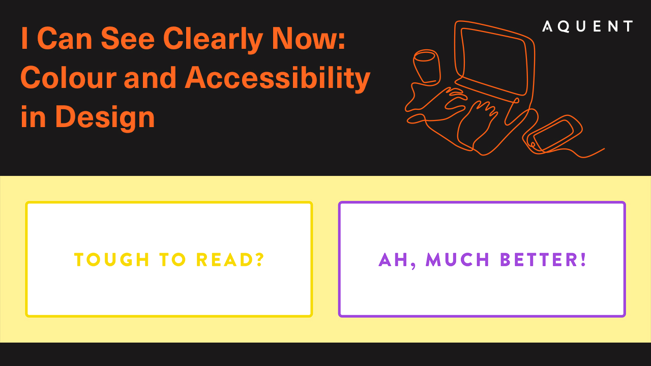
Imagine a website with pale yellow text on a white button — that kind of low contrast combination would make it difficult or even impossible for most people to comfortably read the words on the screen. On the other hand, changing the yellow to a dark shade of purple would ensure that the content is easy for everyone to see against the light background.
Although accessibility optimisation typically falls into the hands of developers, colour contrast compliance is one way that designers can directly take part. The key way to determine if your design has sufficient contrast is to confirm that it adheres to the Web Content Accessibility Guidelines (WCAG) standards as defined by the Web Accessibility Initiative of the World Wide Web Consortium. WCAG's minimum success criterion, SC 1.4.3, dictates the lowest colour contrast that is considered accessible. These guidelines say that normal-sized text, including pictures of text, requires a contrast ratio of at least 4.5:1 while larger text (18px/1.5em or larger, or if bolded, 14px/1.2em or larger) needs a contrast ratio of at least 3:1. To learn more and see the difference clearly for yourself, check out WebAIM's handy contrast checker.
Designing for a Better Experience
While the issue of colour contrast is particularly relevant for those with visual disabilities, prioritising this kind of accessibility can make your website more easy to navigate. Accessibility is synonymous with usability, and everyone benefits when a website is designed with usability at top of mind. While increased contrast mainly serves to help people who perceive colour differently, it can also create a better experience for anyone who happens to be browsing in the glare of bright sunlight, as they make their way down a busy street, or while squinting at a screen in the dark.
Although creating a fully accessible design is never an easy task, ensuring adequate colour contrast is a great way to begin the process.
In addition to guaranteeing that your product is usable to a wider audience, you'll be taking a step in the right direction when it comes to making the web a more inclusive place for everyone.
Latest.

Your complete guide to salary negotiation
Job Seeker


A new job… in this economy?
Job Seeker


How your reputation gets defined before you know it
Thought Leadership